Nice Job Alex

I've had some good fighting in your map last night and checked it out n the ued
First impressions are always important, be it graphical or gameplay, and I think you'll have a popular map here, so all your effort was worth it, imo.
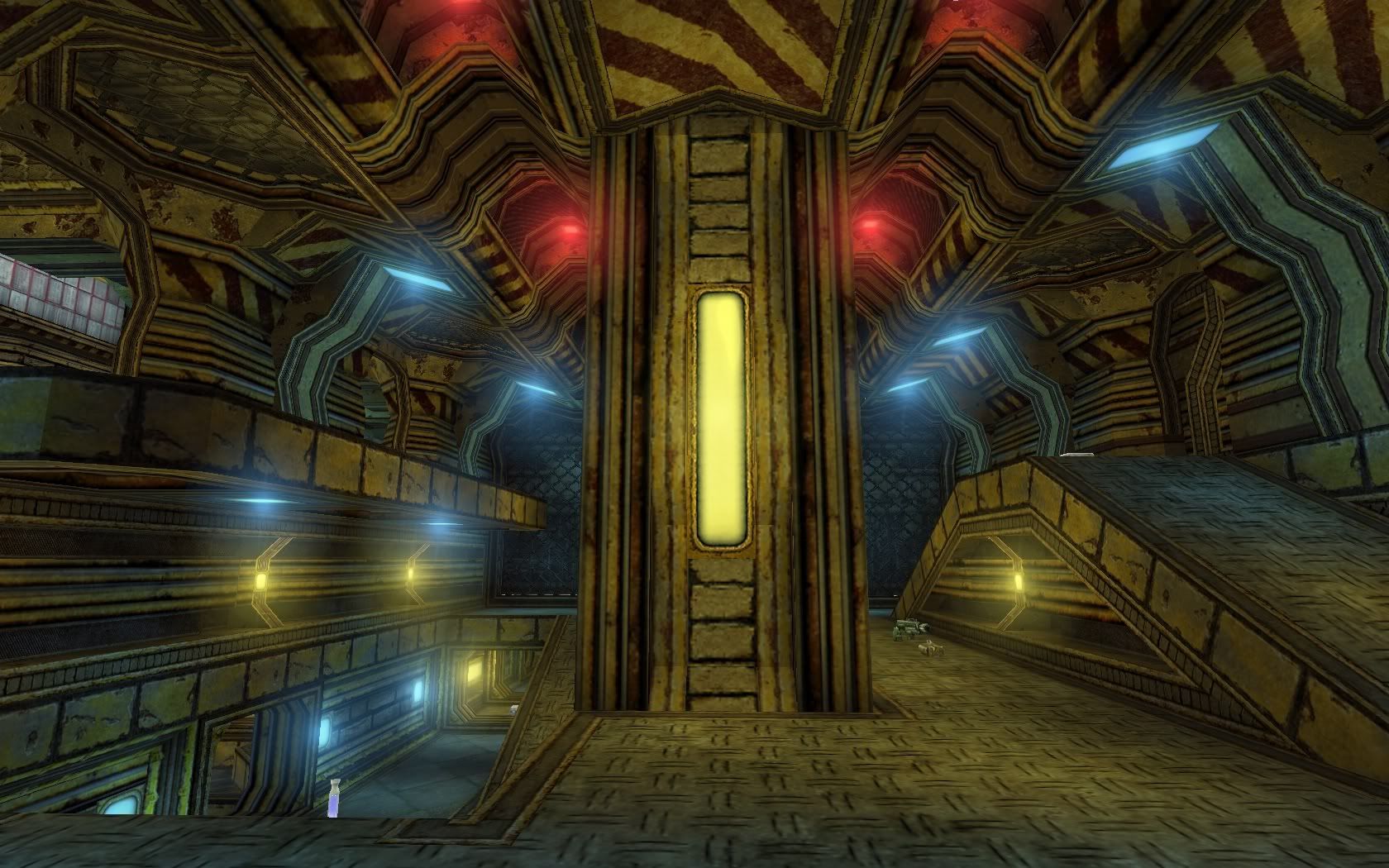
I have a few niggles (heh, mappers *always* do, lol) as peeps who look really closely at things. I should warn you though, I'm not a big fan of Kraden - I never liked that pack, imo it's badly "offscale" as a set and then doesn't scale well when you try and adjust it. So imo it is quite usable but in areas viewed from a bit of distance and not so good for up-close details (so I agree basically with Creav on the resolution points). So all this to say, you are brave (like cooloola) for basing the entire map on it and what you've done generally works

If it were me, I would have mixed in a few more compatible texture sets to make the theme to mix in brown/rusty/grey hues to give relief to all that yellow
The lighting in general has appropriate hues sats and radii, but imo tad too bright in in some areas, as you have "overbright greening" in some spots (not not "hue greening"). That said, some areas and scenes are quite pleasing
Nice to see the big vertical view - I like it when mappers pay attention to scene composition
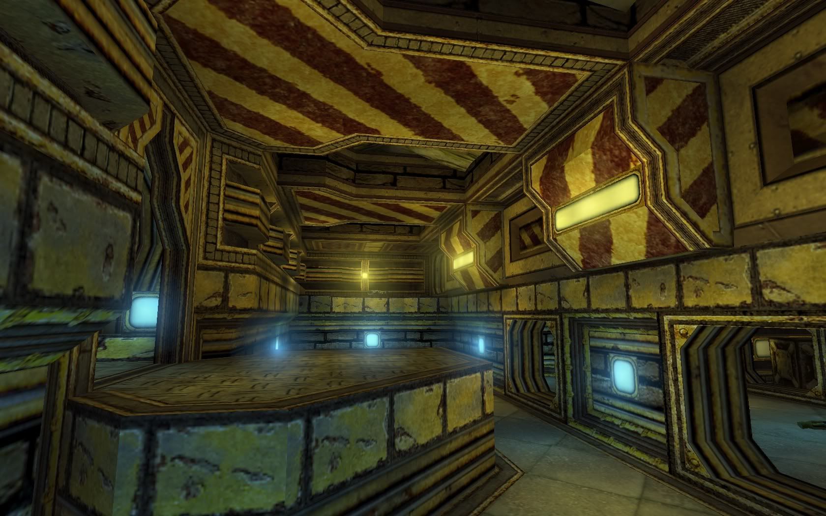
Graphics/geometery, well, a few notes for next time: Yeah, in ut this always a problem with texture scale versus the size of decoration objects (i.e. meshes) and other players/npcs versus the player-point-of-view (camera frustom/height). Old story, in UT99 what looks "right" to the player PPV is actually too large for reality, making the other players you see seem like midgets, lol! To make matters worse, when you start adjusting size of rooms and doors down to more realistic dimensions (heh, look at any of AngelHeart's early maps) you end up in a snaggy unplayable situation. So unreal is really "unreal" lol! Anyways, it's all about compromize and doing what you can to suspend a viewers disbelief (for the few seconds he's got to look around before he gets hit with a rocket).
A few points I will mention about scaling (imo):
- The basic metal floor "double hatched" pattern at scale 1.0 is 4x too big. For believability it has to be scaled down to 0.25 (see pic).
- Chain link fence is also same problem - well, to me it seems too big. Trouble is the diamond type masking (or more correctly angled "lines" in ut are always jaggy and worsen when scaled down, alas, I would use a different mask (like a grid grill pattern or something other than chain-link). Common problem in ut, btw, not really a mistake, just a consequence of chain-links.
 Viewed 5565 times")
- Introdude 4x vs 1.2, looking at the fence
- The rectangular light units by themselves at scale 1 H and V are shown in the pic, they are skinny, but render evenly (look at the beveled edge around the diffuser part). When you scale the H and V to fit (as you've done) the distortion is aggrivating the beveled edge in the V so the bevel looks super jaggy. The Kraden light is the problem. It doesn't scale. Me, nowadays I would spend a few minutes in Photoshop and just create a version thats "fatter" so it doesn't have to be stretched to fit properly (or find another better light texture). Anyways, that's just me nit picking

 Viewed 5565 times")
- Floor and light texture scaling
Gameplay etc: Ah, the important stuff

Nice big FFA map. I played it 1vs1 on adept and then masterful, and then 4player FFA (no mutators) Nick also tested it out and played some jump matches.
Here's some things noticed (all are minor points - again just imo):
The lift was not obvious. Strange sounding noise near the armor (like, wtf was that

). Can see the top of the shaft outside of the udam window - it's black - dunno if you wanted it fakebackdrop. Glass floors and windows - a dirtier texture transparency would be better imo, after all it is a mine, and mines are dirty
Ammo seemed a bit weird - they way it's mixed up at the guns. udam area is ownable, especially in FFA - I think udams and belts should be "hard-to-get" items in DM, that's my opinion, otherwise they become the dominant objective for players which is a flow-spoiler. Heh, and Nick disagrees
Good z-axis in general and a few jousting spots but the outside areas up high are quite campable, especially if you have hitscan and that damn udam! The big ICH walls you have sealing the perimeter in the "court" shows weapon collisions, which i didn't care but Nick complained - and he managed to get over it into the non-playspace area around the buildings - somehow, he was playing with mutators though. I think would have used blocking actors there (a lot of them, stretched up really high). ICH's can mess up your bsp too (well, they are bsp
 Viewed 5565 times")
- ICH walls
One last point was the rocket launcher location. At first I didn't like this - but then later saw it as a good placement because it really cut down on the spam, lol! Well, in FFA you really want RL and shock and they're usually in open areas to encourage traffic (and thus spamming/sniping). Where it is causes a traffic on the jumpdown route which otherwise might not see as much - same with the shock and flak - good stuff! There are a few disappearing brushes and I saw oneor two small edge-homs but generally no glitches (no disappearing floors and pillars like in hian and some of rev's maps, and good framerates everywhere in the map, so I'd say Swanky would give you a pat on the back on your build, GJ

Cheers