Red_Fist wrote:I take that as you could mess with the looks until you are 99 years old, LoL And those guys need to pump out games so they don't have time to tweak it forever. You just have to know when to stop, and there is always SOMETHING, then once you mess with it you wish you didn't.

One of the reasons for posting it right now was for you guys to tell my silly brain to stop doing things to it! last time I attempted to make a DM-1on1 I ended up with a TDM for 24 players half FNB of size lol
Red_Fist wrote:I always set the levelproperties zonelight to 1 or 2 and the levelproperties brightness to 1 or 2 being that I despise 100% black in any onscreen game, just hate it.
But if you set it to 1 it makes it so the area is lit enough to see the darkest corner. But if you only try increasing lights brightness or radius to try and get some area brighter it messes up the spot closer to the light. Then adding more lights messes up other aspects or looks fake.(shadows going the wrong way)
It was already at 1 and I had it bumped up even more with Zone lighting to give a bit of blue to the environment. I think it's the contrast and large dark spots making it look darker than it actually is. I just set it to 1.5 (2 was too bright) plus I had already added a lot more light sources to all areas. I can tweak it later after I redo the textures but at least for testing it won't be more an issue.

Swanky wrote:The higher contrast range will make it easier to identify other players, so that's a plus. If you like it, use it.

I think the general layout is working. There are a lot of ways to tweak botsupport even if just to emulate a certain behavior (had to do so with AMC-Ars_Indus, and I'm sure there are more possibilities than what I've used there), but indepth support should only be added AFTER you're satisfied with the layout. I think I can give more indepth opinions after I've gotten more familiar with the layout itself, beyond feeling that it is good and knowing where to get which item on the fly. That said, this is going to be a lot easier once you've added in a few things to make each area stand apart from each other so it's easier not to get lost.
Ok, since it was brought up, what's your excuse for nothing having a tutorial in level design pinned on mapping?

I was checking AMC-Ars_Indus earlier today to see how you managed to get bots to grab the UDamage
Regarding botpath, I need to tweak some nodes by the ledges and check other places I can make them leap down. set some defense points for TDM, I also need to spread ammo around some more to get them to cover more ground, maybe nudge some nodes around and look for junk ones. Other than that, I don't know what can be done vanilla to improve botsupport.
For players, a lot of the navigation issues were coming from the fact I wasn't diligent with my torch placements. They were calling attention away from the entrances, some of which was too dark to be noticed even, specially the lifts.
I set them so they hightlight the entrances now and the misleading ones were replaced with lanterns. I think some areas desperately need some lure to be part of the map cycle, but I don't know how much I can do before getting into
detailing and without a texture pack defined. The getting lost part is kinda by design until first runners get familiar with all the ins and outs, specially beneath and around the UDamage, but with the new lighting hopefully
it will be a lot easier to differentiate among the 3 main areas. I'll see what I still can do until tomorrow night and I'll be releasing a new beta. Looking foward to hear your thoughts!
sektor2111 wrote:Excuse me if I was bothering you - it was not on purpose - for me this map is good as it is speaking about initial layout idea.
I wasn't feeling bothered at all. If anything I want to break the stigma you have towards mappers and understand there's more to it than putting some brushes together so you can dicern those who want to do a
serious job and those who are in this just for fun. Not that I think there's something wrong with doing just for fun, it's just simply unfair to inherit the bad rep by association.
You didn't have to explain your side, I've downloaded enough maps to know how pathing is usually dealt, but hear mine: I could either leave this map in my laptop cooking for 6 months or so, until I had everything done my way to
only then get someone to play it other than myself, to then find that the layout has issues, that pathing could be improved, that it's too dark for most people, fix all of this, and then after all that maybe get 10 people
to play it once and throw in the bin because it doesn't fit they playstyle or mood and them throw a tantrum because nobody recognized my hard work, even though nobody asked for it and I didn't even bother to check, or...
I could release an early beta, see how people react to the layout and get some playtesting, be open for criticisms and suggestions, make some quick fixes and leave a playable version with a good bot support for
those who got interest in and only then take my time to do all the decorations and what nots. Which one you think works better? Anyways, I get your point and if I didn't know the importance of pathing I wouldn't leave it for later when I can take my time to do it better. Thanks for the support and don't worry about excuses, it's all cool.
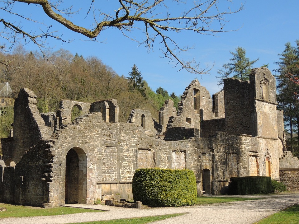
papercoffee wrote:The wood is fine. Dark rotten wood is natural.
For me it's not the wood which creates too much visual noise ... it's the small bricks and the repetitive dark parts.
The stone can be also a little bit brighter ...washed by rain and bleached by the sun. Just an idea.
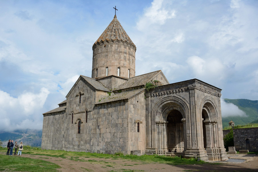
Nice! There are some nice patterns there that I can try and replicate.
The colour scheme was closer to those in early alpha.
The textures I have now are just colour shifted versions of these with a decal. It looks darker than it is because of the lack of lighting and they'd look too blurry at 2x. I was only still using this set because of the arches but I do intend to replace it. I need to look for a good texture of better quality to make a set of with some variations, also the floor looks very muddy and blurry and needs replacement too. I can make the top areas and the more exposed ones bleached and washed out descenting into more darker tones as it gets to the bottom. Thanks for the suggestion!


